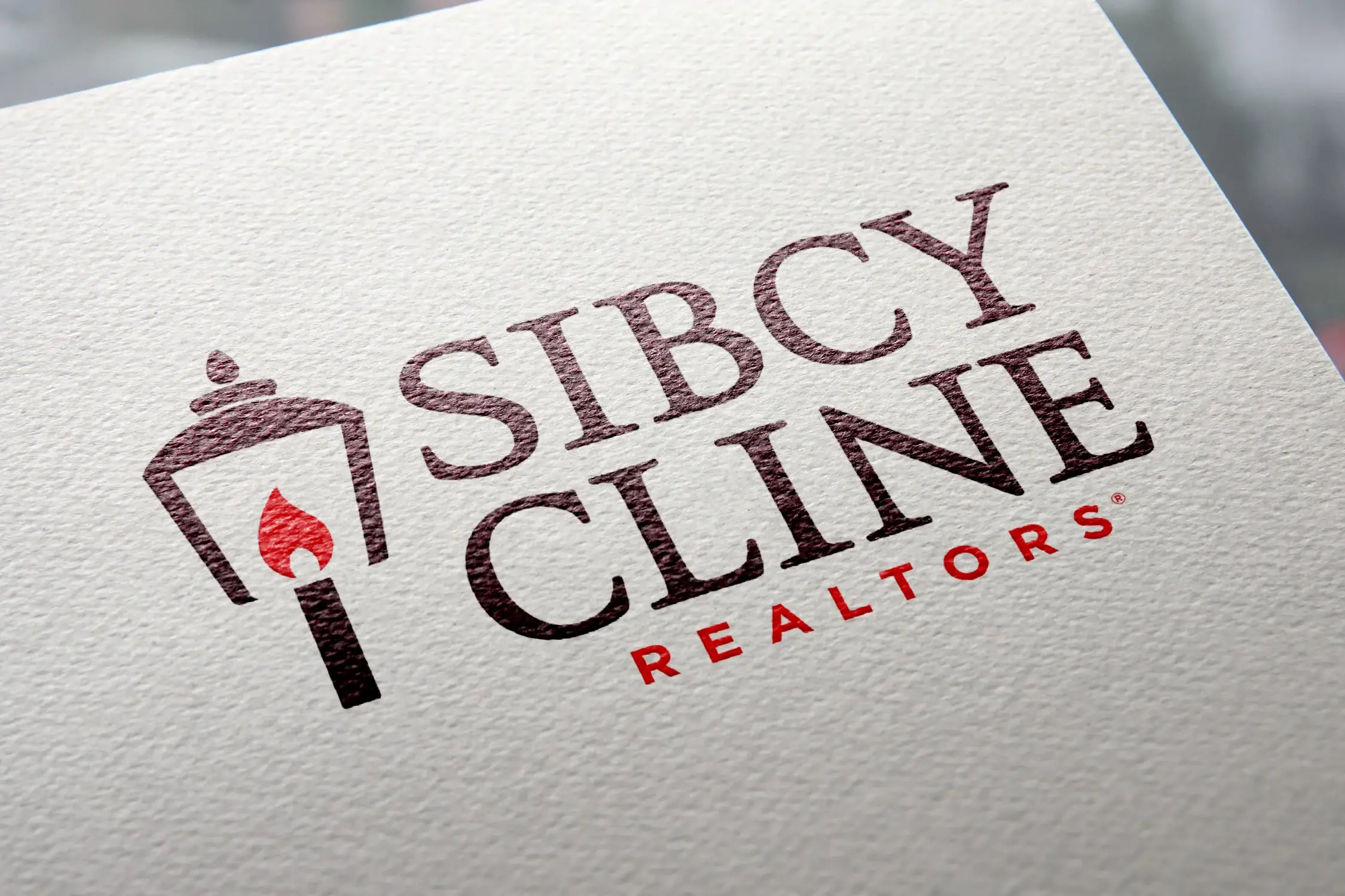
Sibcy Cline Logo
Goal & Challenge: Refresh the Sibcy Cline logo. Sibcy began in the 1930s, and is the largest independent real estate brokerage in the Greater Cincinnati area. Maintaining the recognition of the brand was essential. The logo itself was dated and not representative of the modern, technology-focused company they'd become.
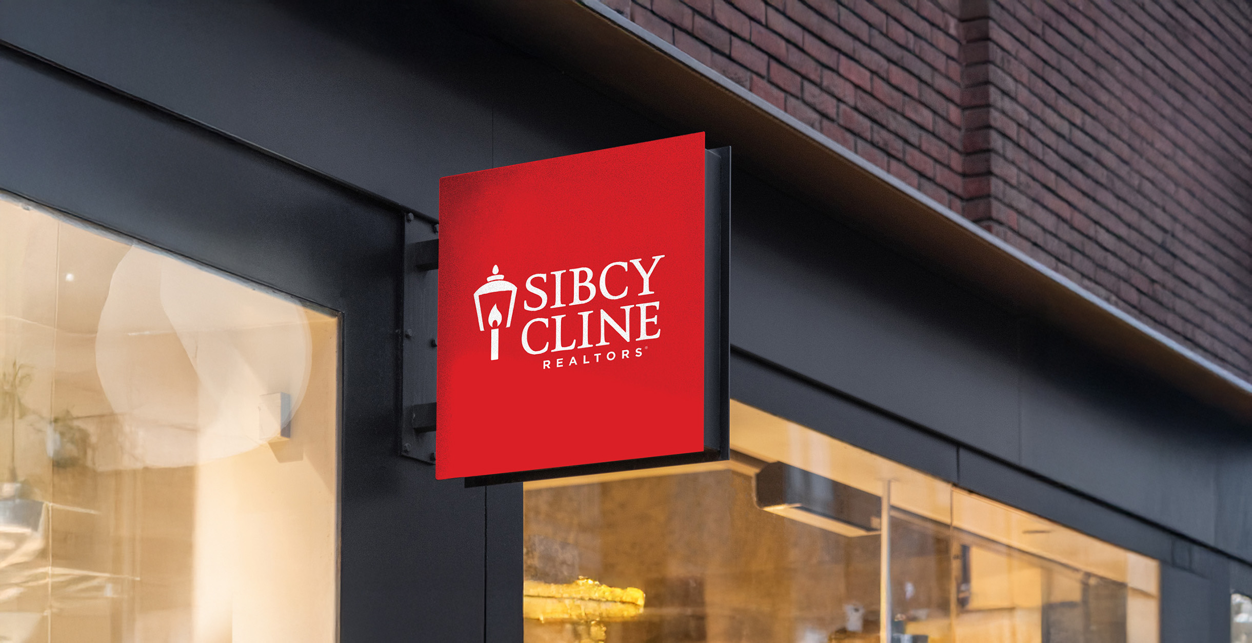
Idea: What are the core recognizable attributes of the brand that need to stay? The color red had been Sibcy Cline's signature color for decades so there was a lot of equity in it and love for it within the company. The lamp post was their iconic symbol, but the antique look of the current mark presented the greatest opportunity for evolving the logo in a more contemporary direction.

Evolution vs. Revolution
The lamp post was their signature icon, conveying warmth and welcoming. Many design options were explored, ranging from the representational to the abstract. The version that was ultimately chosen keeps much of the character of the original while simplifying and modernizing it. The flame—in contrast to a light bulb—preserves the suggestion of a warm, inviting light that guides you to your new home. Keeping the post, versus shifting the mark to a lantern, symbolizes permanence and stability.