Cobalt
Goal: Design a fresh logo and identity for Cohen Recycling's newly restructured division specializing in e-scrap recycling and data security management — formerly known as Cohen Electronics.
Story: E-scrap recycling is a big deal. And as technology continues to turn over at a breakneck pace, safe, secure and effective e-scrap recycling solutions are critical. E-waste accounts for 70% of the toxins entering landfills and it requires verifiable processing by certified recyclers to protect human health and the environment.
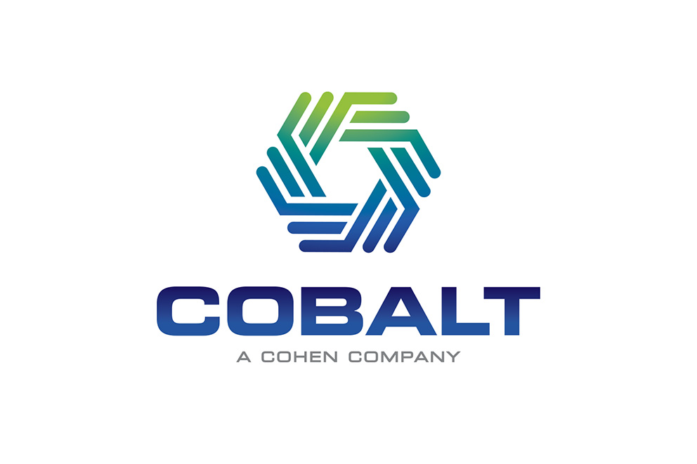
Idea: Transform Cohen Electronics into Cobalt with a call for people to come together to create a “bluer” planet – one that's made more secure, healthy and beautiful through Cobalt’s expertise. The name "Cobalt" was inspired by the Cohen brand color itself, with natural shades of green added to symbolize environmental responsibility.
Identity
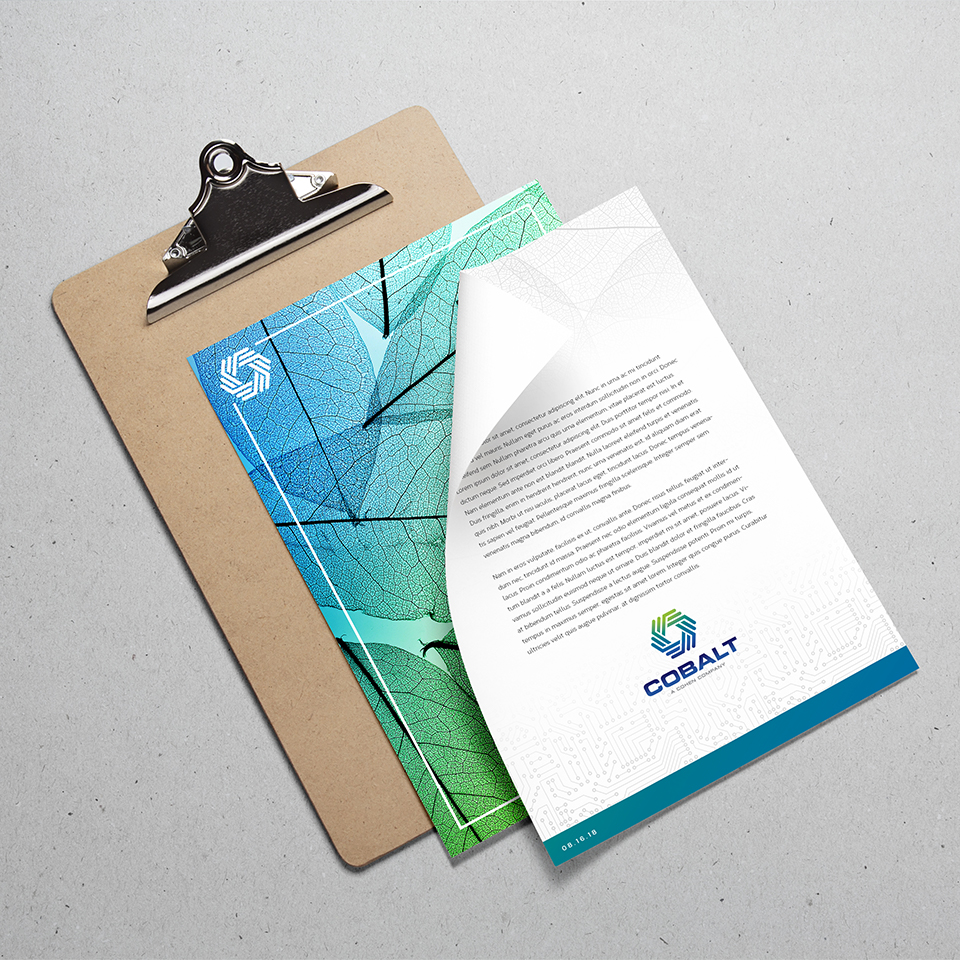
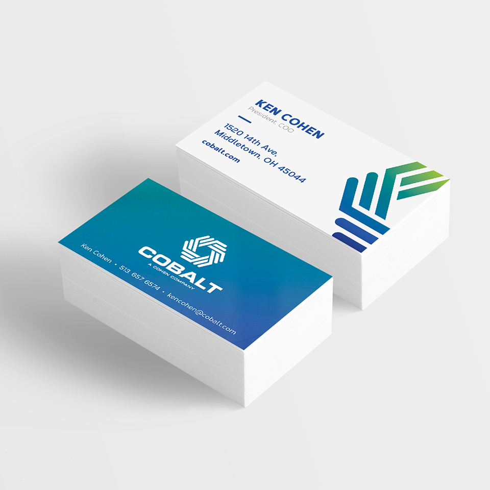
The logo mark uses linework inspired by printed circuit boards, and the way they connect and flow resemble the traditional "recycling" symbol of three arrows flowing into one another. The hexagonal shape is reminiscent of the "C" mark from the Cohen logo, creating corporate symmetry.